Since I start this blog back in spring I have made a multitude of changes to how the blog looks and functions. It has taken me way longer than I expected but I can finally say that I am (mostly) happy with the result, to the point that I finally feel proud to share it with others! In this post I want to share my journey of getting to this point, as a person who knows just enough Liquid / Jekyll / (S)CSS to get by.
Math rendering issues
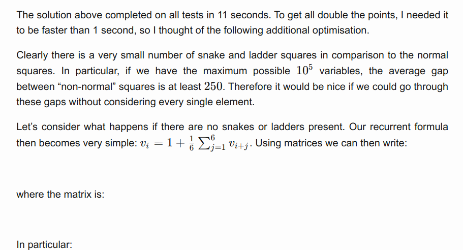
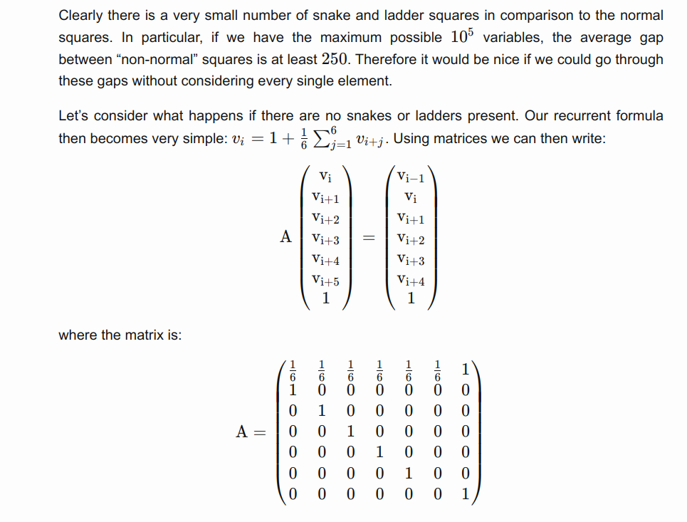
I study mathematics, I like mathematics, I enjoy sharing mathematics. To do this effectively, it is important for me to set up Latex formula support in my blog posts. Initially I thought that this should fairly straightforward, but I encountered quite a few issues along the way: I needed to set up custom delimiters, discovered certain GitHub Pages limitations, and had a few issues with formulas not rendering. In the end this was still one of the easier problems to fix, but took quite a bit of research to figure out the root causes of the problems and how to fix them.
#1: settings up math delimiters
Generally when I write in Markdown, I like to use Mark Text, an amazing Markdown editor. It has a lot of flaws and is extremely buggy, but I can forgive it almost anything, as it provides an amazing interface to write Markdown that gets immediately rendered (including math formulas!).
Long story short, this editor is great for immediate feedback, but it does not allow much configuration, and forces me to use $ and $$ as the 2 delimiters for math formulas, if I want to see them nicely rendered inside the editor. Now the default Kramdown (or MathJax) delimiters are different, and therefore I needed to figure out a way to change them to my liking.
This was not too difficult, and after a bit of research I settled with the following code:
function setupMathDelimiters(){
  renderMathInElement(document.body,{delimiters: [
    {left: "$$", right: "$$", display: true},
    {left: "$", right: "$", display: false}
  ]});
}
Note that the order in which the delimiters are defined is important. The renderer always considers them in order, so reversing the order will mean that every dollar sign matches an inline math element, and it would be impossible to make a display math block.
#2: no support for Kramdown
Now that I figured out how to change delimiters, I additionally decided to update the Katex version that is used in my blog by following the instructions on the Katex website. I decided to use Katex instead of MathJax mostly because I’ve seen claims of it being more efficient. Moreover, it seemed to fix some strange rendering issues that I were experiencing with MathJax!
Cool, so now we have math formulas working. Or so I thought. I uploaded my code, let GitHub Pages do the magic, and one of my posts rendered like this:
In comparison, this is how the same piece of code looked locally:
I was clearly doing something wrong. I looked it up online, and sure enough found my problem: GitHub Pages cannot build websites that use Kramdown as the math engine. As a matter of fact, GitHub Pages has barely any flexibility as to what packages can be included. I quickly tried MathJax but it did not seem to fix the issue. So at this point I have invested quite a bit of time, and I found out that my solution cannot work. What are my options?
The obvious thing to do was to explore the limitations of GitHub Pages further. I refused to believe that I cannot use the plugins that I want to, and I was indeed correct. The solution is rather simple, though it requires slightly more configuration. As GitHub Pages essentially just serves static files, we can build the website locally, and just push the built files to GitHub! I found multiple examples online for how to do this, but I would generally find them inconvenient for one reason or another. In the end I wrote a script myself, as it just seemed quicker than figuring out how to use (and customize) someone else’s solution. Also this was some good practice for writing in Bash. Here is the script that I came up with:
#!/bin/bash

# This is a file to build and push the page to github, so it gets deployed.
# Check that we are in the correct directory, so that we don't accidentally overwrite some files
directory=$(basename "$PWD")
if [ "$directory" != "blog" ]; then
  echo "Calling from wrong directory"
  echo "current directory $directory"
  echo "directory needs to be blog"
  exit 1
fi

# Build the site, without showing the large amount of output
JEKYLL_ENV=production jekyll build -q

# stash any uncommited changes and checkout
git stash
git checkout gh-pages 2>/dev/null || git checkout -b gh-pages

# Clear the directory, except for .git, .gitignore and _site
shopt -s extglob
rm -r !(_site)

# Copy the _site contents into the base directory
cp -R "_site/*" ./

# Commit with optional commit message
git add .
if [ -n "$1" ]; then
  git commit --allow-empty-message -m "$1"
else
  git commit --allow-empty-message -m ''
fi

# Push website
git push origin gh-pages

# Reset to initial state
git checkout master
git stash pop
I can run this script with or without a commit message, and it will automatically push the built website online. There is also a safety mechanism so that I don’t accidentally overwrite the wrong directory (the script needs to be called from a directory called blog, which is what I have it named locally). Now the formulas were (mostly) rendered correctly.
#3: Kramdown inside math formulas
The last issue I encountered was a rather surprising one, as it didn’t make much sense. When using \text and \texttt inside math formulas, characters like _ and * would be interpreted as Markdown, and there were therefore strange formattin artifacts. So I needed to make sure that these get escaped with a backslash.
Table of contents
While fixing the math formatting in my recent extra long blog post, I realised how much of a pain it is to navigate such a post by scrolling up and down. So I decided to add a table of contents to my posts. Here are the requirements:
- The table of contents needs to be always visible, preferably on one of the sides.
- For small screens the table of contents should be hidden under a hamburger icon.
- I need to be able to specify which header sizes to use in the table of contents, unique to that post.
- It has to look nice, or at least not out of place.
Now there is a Kramdown table of contents that can be placed with the command {:toc}. However, it’s customization is quite limited. Since I barely knew any Liquid at this point, I decided to steal someone else’s solution. I settled on the following project, as it seemed the easiest to understand.
Now the functionality was there, I just needed to adjust the looks. This consisted of a few steps.
- The original CSS styling did not look very good. Once again, I borrowed ideas from a few projects I found on GitHub and simplified them until they only contained what I wanted with quite minimalistic design.
- I decided to redo the layout of my website, and have 2 columns: the title + content column, and the sidebar column, where I could have the link to the About section, some page specific elements like the table of contents.
- I decided to make the table of contents sticky, so that it stays on screen even when we scroll down (that’s kind of the point of a table of contents).
The last 2 points in combination took an embarisingly long time. It made me realise just how little I know about CSS when I spent hours trying to figure out why certain CSS properties do not work as I expect them to. :D Now my CSS debugging skills have improved significantly (not that I think I’ll need them much, but any debugging skills are nice to have), and I feel a lot more confident that I understand how DOM styling works.
Smooth scrolling
To finish off my table of contents I noticed that clicking on the links was very “jumpy”, immediately taking me to the section that I clicked on. I had a much more enjoyable experience on many other websites where it would quickly scroll to the position instead, so I knew that I could change the behaviour. After a quick search online, the solution was simple: simply set scroll-behavior: smooth; on the html element and enjoy the results.
Filters
The last piece of functionality that I added to the blog was the ability to filter elements. This part was somewhat tricky, as I needed to figure out how to access the . In the end I came up with a fairly straightforward solution:
-
Use Liquid to create a button for each tag that would be used to filter the posts.
-
Use Liquid to encode tags belonging to a each post as a class. This was slightly tricky, as I couldn’t find examples of how to add a variable number of classes with Liquid. Luckily, the following worked:{% raw %}
<li class=" {% for tag in site.tags %} {% if post.tags contains tag[0] %} tag-{{ tag[0] }} {% endif %} {% endfor %} post-list-element"> ... </li> ```{% endraw %} -
Finally, the following (fairly standard) JavaScript handles correct filtering of the elements:
function filter(tag, event) {
  if (!event) {
    event = window.event;
  };
  var el = (event.target || event.srcElement);

  posts = document.getElementsByClassName("post-list-element");
  if(el.classList.contains("toggled")){
    // untoggle element
    // show all posts
    el.classList.remove("toggled");
    for(i of posts){
      if(i.classList.remove("hidden"));
    }
  }
  else{
    // untoggle any previously toggled elements
    // toggle element
    // show only posts that have this tag
    buttons = document.getElementsByClassName("filter_button");
    for(i of buttons)i.classList.remove("toggled");
    el.classList.add("toggled");
    for(i of posts){
      if(i.classList.contains(`tag-${tag}`)){
        i.classList.remove("hidden");
      }
      else{
        i.classList.add("hidden");
      }
    }
  }
}
Finishing touches
At this point I was happy with the functionality of the website but I wanted to make it look more visually appealing. Firstly I greatly simplified the site footer: I only left several monochrome icons linking to various of my online profiles. I actually learnt quite a bit about the svg format by doing this, as I had to find most of the logos myself, and edit them to look similar to each other. In fact, since tryhackme’s logo is very detailed and not at all square, I manually deleted parts of the logo and recentered it to not look out of place.

Finally I added some colour to the posts to make them more lively. Here is the final result! :)
Conclusion
This blog has turned out to be quite a project for me, spanning close to a year already. Now that I’m happy with how it looks, I will definitely start sharing it more. I have a lot of really cool projects lined up on my TODO list, so (assuming that I have at least some off-time during my studies) expect the quality and quantity of posts to increase considerably in the near future